Easily convert viewport height (VH) to pixels (PX) with this free online CSS unit converter. Ideal for web designers, developers, and UI/UX professionals, this calculator ensures precise scaling for responsive layouts, full-height designs, and dynamic sections.
✅ Perfect for scaling elements relative to the viewport height.
✅ Designed to streamline your workflow for fluid, scalable layouts.
Start Converting Now →
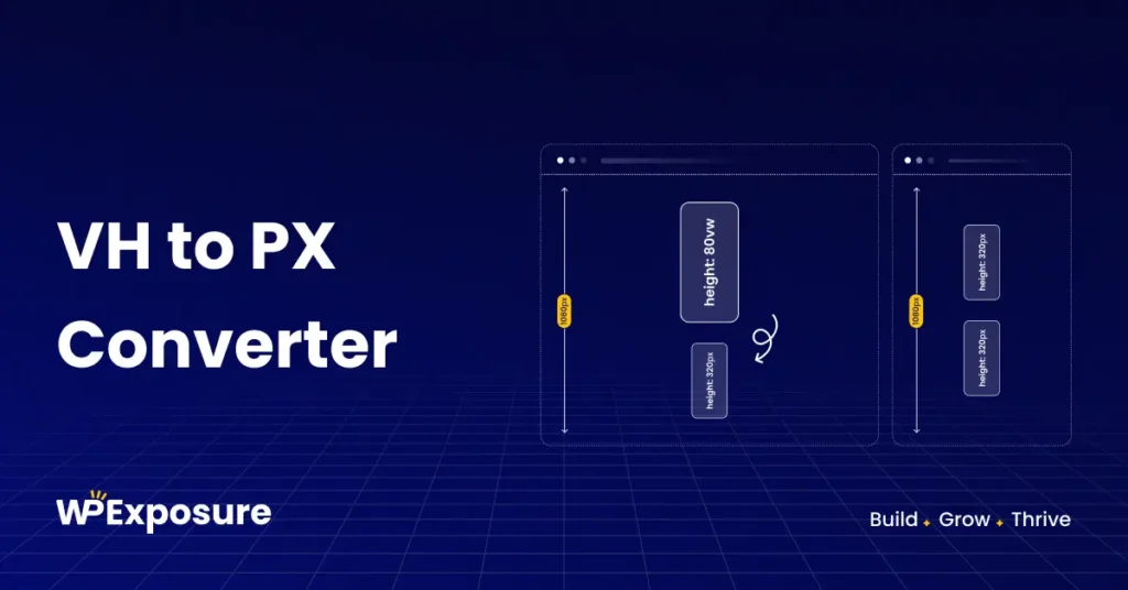
VH to PX Conversion Calculator
VH to PX Converter
Enter your VH value below to instantly convert it to PX.
- Input Field → Enter VH Value
- Viewport Height (VH) Input → Enter Viewport Height Value (default: 1080px)
- Convert Button → Instantly Calculate PX Value
- Copy Button → One-click copy for easy use in CSS code
- Reset Button → Clear your inputs with one click
Example Calculation:
1vh at 1080px viewport = 10.8pxVH to PX Conversion Table (Based on 1080px Viewport)
| VH | PX |
|---|---|
| 0.5vh | 5.4px |
| 1vh | 10.8px |
| 2vh | 21.6px |
| 5vh | 54px |
| 10vh | 108px |
| 15vh | 162px |
| 20vh | 216px |
| 25vh | 270px |
| 30vh | 324px |
| 50vh | 540px |
Use this table for common conversions in CSS for better scalability.
How to Use the VH to PX Converter?
Step 1: Enter your VH value in the input field.
Step 2: Enter your desired viewport height (default 1080px for desktop).
Step 3: Click the “Convert” button to get the PX value instantly.
Step 4: Use the copy button to grab the calculated PX value for quick use in your CSS code.
Step 5: Reference the conversion table for standard values.
💡 Pro Tip: For accurate scaling, consider viewport breakpoints like 900px, 768px, or 360px when designing responsive layouts.
When to Use VH vs PX in CSS?
VH (Viewport Height)
✅ Preferred for responsive web designs where elements scale relative to the viewport height.
✅ Best used for full-height hero sections, dynamic content, and flexible designs.
PX (Pixel)
✅ Best for fixed-size elements where precision is required.
✅ Ideal for icons, borders, and elements that shouldn’t scale.
Which One Should You Use?
- Use VH for elements that should adapt to viewport changes.
- Use PX for precise, fixed-size elements.
FAQs About VH to PX Conversion
Try Our CSS Unit Converters for Free!
Looking for more CSS unit conversions? Explore our full range of free conversion tools: